
- Most marketing teams still spend the first week of every month rebuilding reports that were already built last month, just with new numbers pasted in.
- Marketing dashboard tools fix this by connecting directly to ad platforms, CRMs, and analytics tools, pulling live data without a spreadsheet in the middle.
- Looker Studio is free and good enough for many teams. Whatagraph and AgencyAnalytics are built for agencies that need white-label reports at scale.
- The right choice depends on who builds the dashboard (analyst or non-technical marketer), how many data sources you need, and whether clients need to see the output.
- Supermetrics is a connector, not a dashboard, and teams often confuse the two before buying the wrong thing.
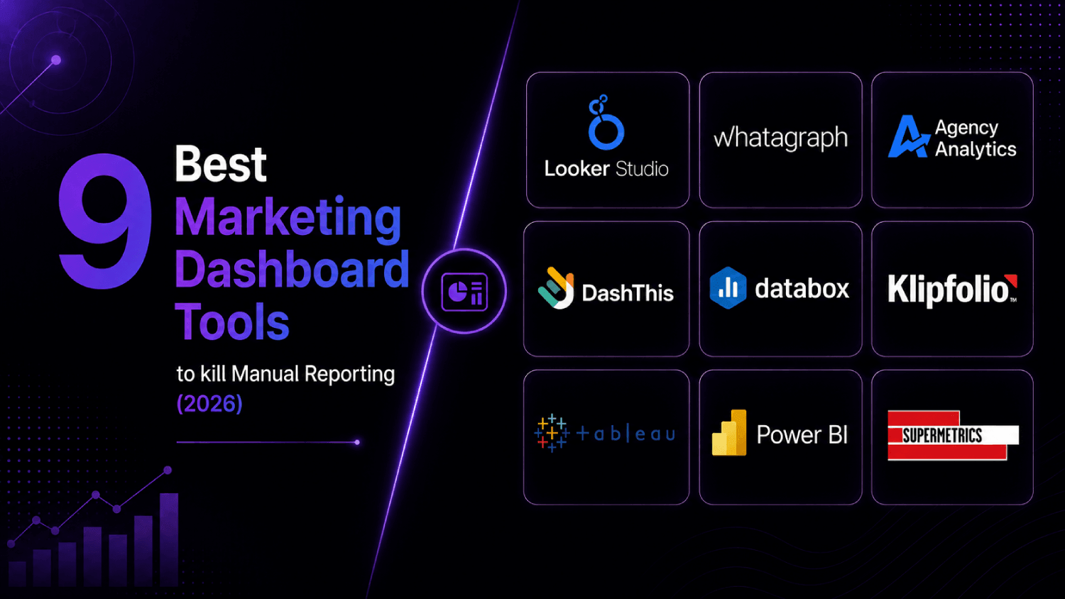
The strongest marketing dashboard tools in this comparison are Looker Studio (free, highly flexible), Whatagraph (best for multi-client reporting), AgencyAnalytics (best agency all-in-one), DashThis (simplest to deploy), Databox (best for mobile and goal tracking), Klipfolio (best for custom KPI logic), Tableau (best for enterprise BI), Power BI (best for Microsoft-stack teams), and Supermetrics (best as a data layer feeding other tools). Each has a clear use case and a clear ceiling.
Why Manual Reporting Is a Stack Problem, Not a Discipline Problem
The marketer who rebuilds the same slide deck every month is not lazy. They are working with infrastructure that was never designed for reporting. Ad platforms, email tools, CRMs, and web analytics each export data in different formats, on different schedules, with different field names for the same metric. Stitching that into a single view by hand is genuinely hard, and it takes time that should go toward analysis.
Marketing dashboard software solves this at the connection layer. Instead of exporting CSVs, the tool authenticates directly to each platform via API, pulls data on a schedule you set, and renders it in a template you built once. The dashboard updates itself. That is the value proposition, and every tool in this list delivers some version of it.
Where they diverge is in who can build those dashboards, how much they cost, how many connectors they include, and whether the output is designed for internal ops teams or external client delivery.
The AboutMartech Dashboard-Fit Test: Four Questions Before You Buy
Before comparing features across nine tools, run this four-part check. Skipping it is how teams end up buying Tableau for a five-person marketing department that needed DashThis.
- Builder profile: Will the primary dashboard builder be a marketing analyst comfortable with SQL and data modeling, or a demand-gen manager who needs drag-and-drop? Tools built for analysts (Tableau, Power BI, Looker Studio with BigQuery) have steeper learning curves but far more flexibility. Tools built for marketers (DashThis, AgencyAnalytics, Databox) deploy faster but hit ceilings faster.
- Data source count: Count your actual connected sources: Google Ads, Meta Ads, LinkedIn, GA4, HubSpot, Salesforce, Mailchimp, and whatever else touches your funnel. Some tools charge per connector. Others bundle everything. A team running eight sources on a per-connector plan can easily exceed the cost of a flat-rate alternative.
- Audience for the output: Internal ops dashboards and client-facing reports have different requirements. If a client sees the report, you need white-labeling, branded PDFs, and scheduled email delivery. If it is internal, none of that matters.
- Update frequency: Daily refreshes are fine for most marketing reporting. If you need intraday data (say, live ad spend against a daily budget cap), confirm the tool supports it at your plan tier before signing.
Which Marketing Dashboard Tools Actually Belong on This List?
The nine tools below were selected because each has a defensible primary use case, transparent public pricing (or a clear reason to be quote-based), and a meaningful connector library for marketing data sources. Tools that are pure BI platforms with no meaningful marketing connector library were excluded. So were tools that are primarily connector pipes without a visualization layer.
| Tool | Best For | Starting Price | Native Marketing Connectors | White Label |
|---|---|---|---|---|
| Looker Studio | Analysts, Google-stack teams | Free | Google properties native; others via connectors | No |
| Whatagraph | Multi-client agency reporting | Quote-based | 45+ marketing sources | Yes |
| AgencyAnalytics | Agency all-in-one reporting | From $12/mo per client (public pricing page) | 80+ integrations | Yes |
| DashThis | Fast deployment, non-technical users | From $49/mo (public pricing page) | 34+ marketing integrations | Yes (higher tiers) |
| Databox | Goal tracking, mobile access | Free tier; paid from $47/mo (public pricing page) | 70+ integrations | Limited |
| Klipfolio | Custom KPI logic, formulas | From $125/mo (public pricing page) | 100+ service connections | Yes (via PowerMetrics) |
| Tableau | Enterprise BI, complex data modeling | From $15/user/mo (Tableau Public free) | Broad, with Salesforce native | Yes (via Tableau Embedded) |
| Power BI | Microsoft-stack organizations | Free tier; Pro from $10/user/mo (public pricing page) | Broad via connectors | Via Power BI Embedded |
| Supermetrics | Data pipeline feeding other tools | From $29/mo (public pricing page, varies by destination) | 100+ marketing sources | No (it is a connector, not a dashboard) |
Looker Studio: Best Free Option for Google-Stack Teams
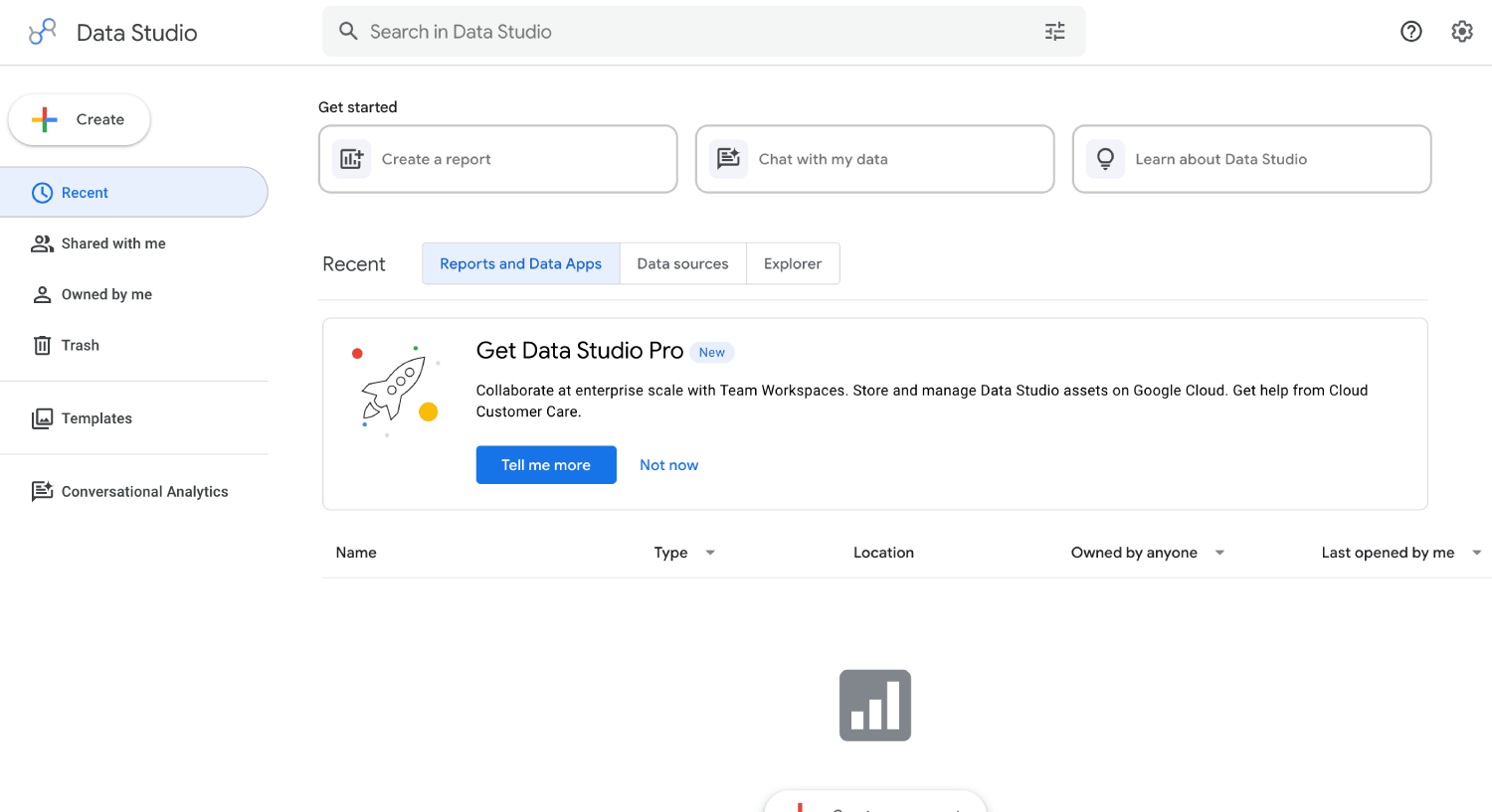
Looker Studio (formerly Google Data Studio) is free, and for many marketing teams, that is the only sentence that matters. It connects natively to Google Analytics 4, Google Ads, Google Search Console, YouTube, and BigQuery with zero authentication friction. Third-party connectors for Meta, LinkedIn, HubSpot, and others are available through the connector marketplace, though the quality and maintenance of those connectors varies widely.
The trade-off is setup time. Looker Studio has no pre-built marketing report templates that work out of the box for a mixed-source funnel view. Building a clean dashboard that pulls GA4 sessions, Google Ads spend, and HubSpot pipeline data into a single view requires configuration work. Teams with an analyst or MOps resource who can invest that upfront time get a genuinely powerful, infinitely customizable tool at no cost. Teams expecting a plug-and-play experience will be frustrated.
Looker Studio does not offer white-labeling, scheduled PDF exports at the tool level (without workarounds), or a client portal. It is an internal analytics tool, not a client reporting platform.
Whatagraph: Best for Agencies Managing Multiple Client Campaigns
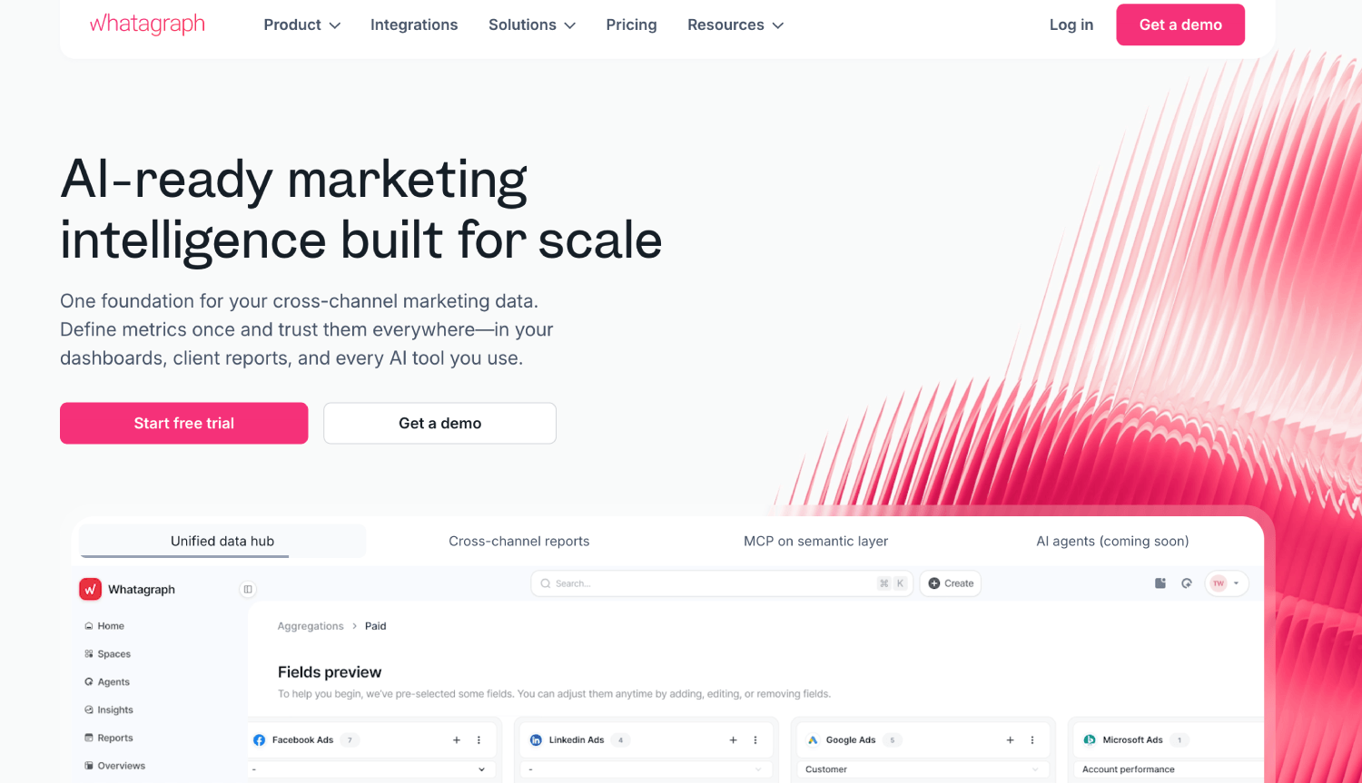
Whatagraph was built specifically for agency reporting, and that focus shows in the product’s architecture. It connects to over 45 marketing data sources, includes a template library designed for channel-specific reporting (paid search, SEO, social, email), and generates white-labeled PDF reports that can be scheduled for automatic delivery to clients.
The cross-channel report builder lets agencies pull data from multiple client accounts across different platforms into a single report view without manually toggling between ad accounts. That matters at scale: an agency running 30 clients across Google Ads, Meta, and LinkedIn does not want to rebuild the same report structure 30 times.
Whatagraph pricing is quote-based rather than publicly listed in a transparent tier structure. Teams should request a demo and push for a per-seat or per-client breakdown before comparing against AgencyAnalytics or DashThis on cost.
AgencyAnalytics: Best All-in-One Platform for Marketing Agencies
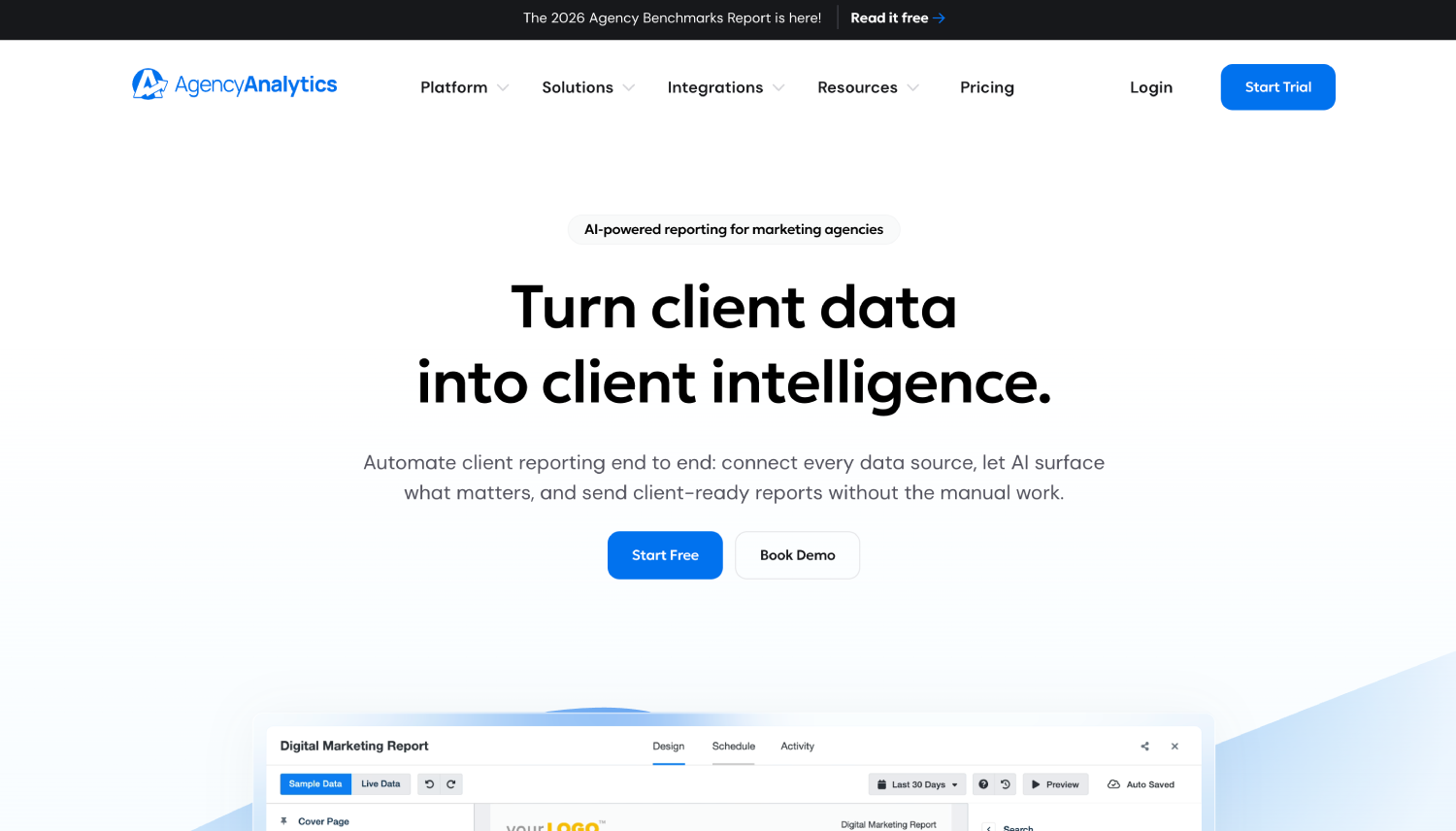
AgencyAnalytics competes directly with Whatagraph but takes a broader approach. Beyond dashboards and reporting, it includes rank tracking, site audits, and a client portal where clients can log in and view their own reports. According to AgencyAnalytics’ public pricing page, plans start at $12 per month per client campaign on the Starter tier.
The 80-plus integration count covers the major paid channels, organic search tools, social platforms, email marketing, and CRMs. For an agency that wants to consolidate SEO rank tracking, backlink monitoring, and marketing reporting into a single invoiced tool, AgencyAnalytics reduces the number of separate subscriptions in play.
The limitation is depth. Teams that need complex calculated metrics, custom attribution modeling, or SQL-level data transformations will find AgencyAnalytics constraining. It is optimized for standardized channel reporting, not custom analytical models built from scratch. If your reporting needs map cleanly to standard channel KPIs, it works well. If they do not, Looker Studio or Tableau will serve better.
DashThis: Best for Non-Technical Marketers Who Need Reports Fast
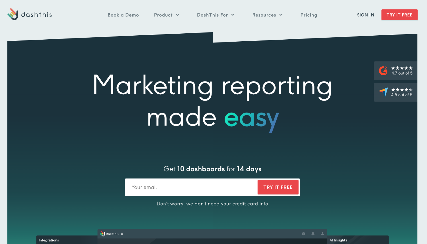
DashThis prioritizes time-to-first-report over customization depth. The drag-and-drop interface, pre-built templates for common marketing channels, and straightforward connector setup mean most teams can have a working dashboard within a few hours of signing up. According to DashThis’ public pricing page, plans start at $49 per month for three dashboards.
White-labeling is available on higher-tier plans, making it a viable option for smaller agencies that do not need Whatagraph’s scale. The connector library covers 34-plus marketing integrations including Google Ads, Meta, LinkedIn, Mailchimp, and Shopify, which covers the typical SMB marketing stack.
DashThis has a hard ceiling on calculated metrics and cross-source data blending. If you need a metric that does not exist natively in one of your connected platforms (say, a custom blended ROAS across two ad platforms weighted by revenue attribution), DashThis will not get you there. For straightforward channel reporting, it is among the fastest paths from data to shareable report.
Databox: Best for Goal Tracking and Mobile-First Teams
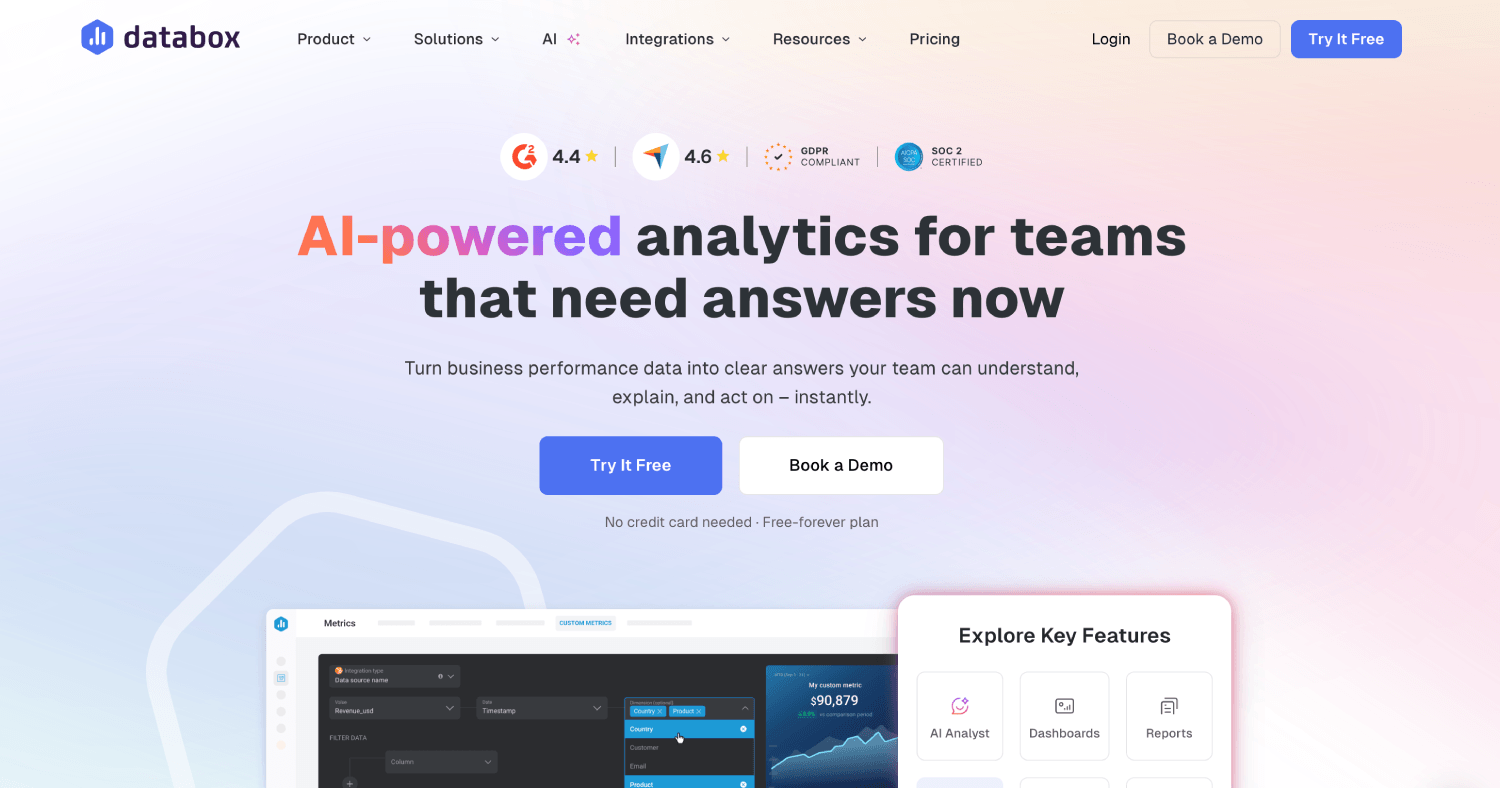
Databox has an unusually strong mobile app, which distinguishes it from most dashboard tools that are effectively desktop-only products. For teams where the CMO or VP of Marketing wants a live view of key metrics on their phone, that is not a minor detail. Databox renders properly on mobile and pushes alerts when metrics hit defined thresholds.
The goal-tracking interface lets teams set targets against specific metrics and visualize progress in real time, which is useful for weekly sprint reviews and QBR prep. According to Databox’s public pricing page, a free tier exists with limited features, and paid plans start at $47 per month. The 70-plus integrations cover most marketing data sources a mid-market team would use.
White-labeling is limited compared to AgencyAnalytics or Whatagraph, so Databox is better positioned as an internal operations tool than a client delivery platform. Teams that need both a client-facing reporting layer and an internal KPI tracking view should evaluate whether they want two tools or one tool that does both adequately.
Klipfolio: Best When Your KPIs Require Custom Formula Logic
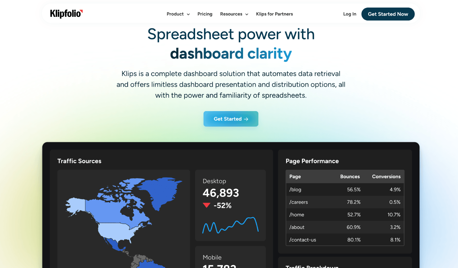
Klipfolio occupies a specific niche: teams that need to define metrics that do not exist out of the box in any native platform. Its formula editor lets users write custom calculations across data sources, which matters when you are tracking a blended efficiency metric or a conversion rate that combines data fields from two separate systems in a way no pre-built template accounts for.
The product has two distinct layers: the original Klipfolio dashboards (more complex, powerful) and PowerMetrics, a newer metric management layer designed to be more accessible. According to Klipfolio’s public pricing page, plans start at $125 per month. The connector library covers 100-plus data sources.
Klipfolio is worth evaluating for MOps teams that have outgrown the preset metric libraries in tools like Databox or DashThis but do not need full SQL-based BI. It sits between those marketing-native tools and Tableau in terms of technical demand and analytical ceiling.
Tableau: Best for Enterprise Teams That Need Marketing Inside a Broader BI Stack
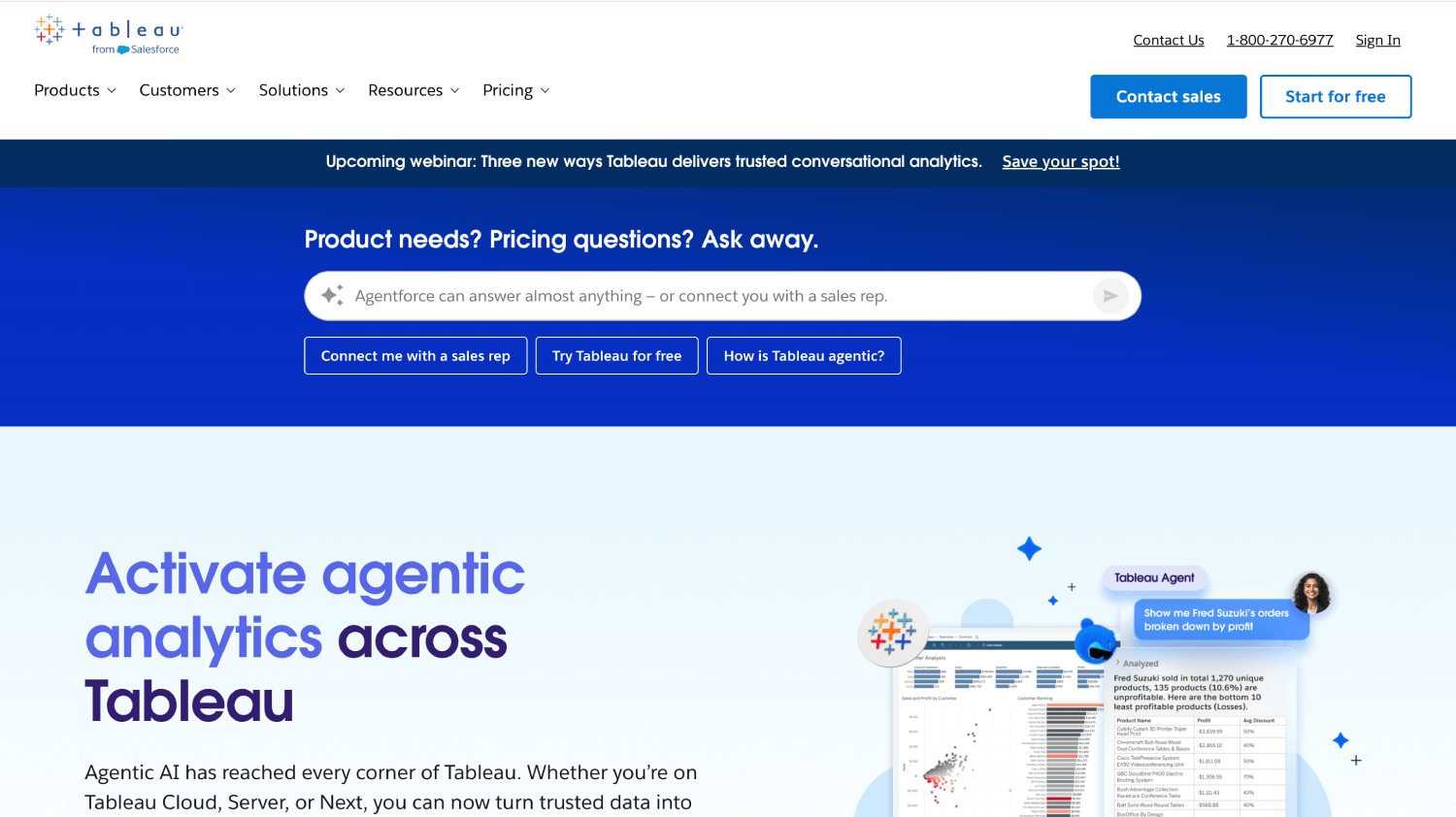
Tableau is not a marketing dashboard tool in the narrow sense. It is a full BI platform, and using it only for marketing reporting is like buying a commercial kitchen to make toast. But for enterprise organizations where marketing data lives alongside finance, operations, and product data in a central data warehouse, Tableau is often already deployed. In that context, building marketing dashboards in Tableau avoids adding another tool to the stack.
According to Tableau’s public pricing page, the Viewer tier starts at $15 per user per month, with Creator licenses priced higher. Salesforce’s acquisition of Tableau means native Salesforce CRM data integration is strong. Teams running the full Salesforce suite (CRM, Marketing Cloud, Pardot) get meaningful native connectivity.
The learning curve is real. A non-technical marketer cannot build a useful Tableau dashboard without training. If there is no analyst or BI engineer to own the build, Tableau is the wrong choice regardless of its capabilities. Pair it with a proper marketing attribution tool if you need to go beyond channel reporting into multi-touch revenue analysis.
Power BI: Best for Organizations Already in the Microsoft Stack
Power BI is the obvious choice when the organization runs on Microsoft 365, Azure, and Dynamics 365. According to Microsoft’s public pricing page, Power BI Pro is $10 per user per month, and a free tier exists for individual use. The integration with Excel, SharePoint, and Azure Data Factory means marketing data can flow into dashboards that non-technical stakeholders already know how to use in familiar Microsoft interfaces.
The connector library is broad via Power Query, though marketing-specific connectors require more setup than in tools like Databox or AgencyAnalytics. An MOps team comfortable with Power Query M language can build sophisticated marketing dashboards. A team expecting plug-and-play marketing connectors will need to budget for configuration time or use Supermetrics as a data layer feeding Power BI.
Power BI Embedded allows organizations to publish dashboards inside other applications, which matters for teams building internal tools or client portals. For pure marketing reporting at a 20-person company, Power BI is overkill. For a 500-person organization standardizing on Microsoft infrastructure, it is the rational default.
Supermetrics: Best as the Data Layer Feeding Your Dashboard of Choice
Supermetrics is not a dashboard tool. It is a data pipeline tool that extracts data from marketing platforms and loads it into a destination: Google Sheets, Looker Studio, BigQuery, Snowflake, Power BI, or others. Teams that already have a BI tool or a preferred reporting environment but struggle with the data extraction and normalization layer use Supermetrics to solve that specific problem.
According to Supermetrics’ public pricing page, pricing varies by destination. A plan feeding Looker Studio starts at $29 per month; plans feeding data warehouses are priced higher. The connector library covers 100-plus marketing sources, which is among the broadest in the market.
The mistake teams make is buying Supermetrics and expecting dashboards to appear. It surfaces normalized data in your chosen destination. The visualization and dashboard logic still needs to be built there. Supermetrics pairs well with Looker Studio for a low-cost, high-connector reporting stack, or with BigQuery and Tableau for a more sophisticated warehouse-backed setup. Teams building that kind of architecture should also review how reverse ETL tools fit into the data activation side of the same stack.
What About Attribution: Where Does It Fit Alongside These Tools?
Marketing dashboards report what happened. Attribution models explain why revenue moved. The two are complementary, not competitive. A team running AgencyAnalytics or Databox for weekly channel reporting still needs a separate attribution layer if they want to understand which touchpoints drove closed deals.
Tools like Rockerbox, Northbeam, and Triple Whale sit in that attribution category, and their outputs can feed into dashboard tools via API or Supermetrics connectors. If your primary question is “which campaigns are driving pipeline,” a dashboard tool alone will not answer it with any reliability. The B2B attribution tools built for long sales cycles address that measurement gap specifically.
How to Stack These Tools: A Worked Scenario
Consider a 40-person B2B SaaS company with a three-person marketing team: one demand-gen manager, one content lead, and a VP of Marketing. They run Google Ads, LinkedIn Ads, organic SEO, HubSpot email, and GA4. The VP wants a weekly dashboard she can share with the CEO. The demand-gen manager needs daily ad performance visibility. The content lead needs monthly organic search reporting.
In this scenario, Looker Studio connected via Supermetrics covers most needs at low cost. Supermetrics pulls data from Google Ads, LinkedIn, GA4, and HubSpot into Looker Studio. Three separate dashboard views serve the three reporting cadences. Total cost: Supermetrics at roughly $29 to $99 per month depending on connector count, Looker Studio at $0. That stack costs less than most single-tool alternatives and handles the use cases without a BI team.
If the VP wants branded PDF reports sent automatically to the CEO and board each Monday, that specific requirement pushes the stack toward DashThis or AgencyAnalytics, which handle scheduled white-labeled delivery more cleanly than Looker Studio. The $49 to $99 per month cost difference is worth it for that capability alone if it is genuinely needed. Teams at this stage evaluating their broader analytics infrastructure should also consider where their customer data platform fits relative to these reporting layers.
Frequently Asked Questions About Marketing Dashboard Tools
What is the difference between a marketing dashboard tool and a BI tool?
Marketing dashboard tools connect directly to marketing data sources (ad platforms, CRMs, email tools) and render channel-specific KPIs in pre-built or templated views. BI tools like Tableau and Power BI are general-purpose data visualization platforms that can handle marketing data but require more configuration and technical expertise to set up. Marketing dashboard tools trade customization depth for faster deployment and marketing-specific connectors.
Can Looker Studio replace a paid marketing dashboard tool?
For teams with an analyst who can build and maintain the dashboards, yes. Looker Studio is free and flexible enough to handle complex multi-source marketing reports when connected to a data pipeline like Supermetrics. It falls short for teams that need white-labeled client reports, scheduled PDF delivery, or drag-and-drop setup without technical involvement. Those requirements point to DashThis, AgencyAnalytics, or Whatagraph.
Which marketing dashboard tool is best for agencies?
AgencyAnalytics and Whatagraph are the two strongest agency-focused options. AgencyAnalytics is better when the agency also wants SEO rank tracking and a client login portal bundled in. Whatagraph is better when the primary need is cross-channel report automation and branded PDF delivery across a large client roster. DashThis is a viable lower-cost alternative for smaller agencies with simpler reporting needs.
Does Supermetrics build dashboards?
No. Supermetrics extracts and moves marketing data into destinations like Looker Studio, Google Sheets, BigQuery, or Power BI. It does not have its own dashboard or visualization layer. Teams that buy Supermetrics still need a separate tool to build the actual dashboard. It is a data connector and pipeline tool, not a reporting interface.
How often do marketing dashboards refresh their data?
Most marketing dashboard tools offer daily data refreshes on standard plans. Intraday or hourly refreshes are typically available on higher-tier plans or as add-ons, and not all tools support them for every data source. Ad platform APIs often have their own refresh rate limits independent of the dashboard tool’s schedule. Confirm the actual refresh cadence for your specific data sources before assuming real-time visibility.
What marketing metrics should be on a standard executive dashboard?
An executive marketing dashboard typically covers total pipeline generated, cost per lead by channel, MQL-to-SQL conversion rate, blended customer acquisition cost, total ad spend versus budget, and website sessions by source. Channel-specific metrics (Google Ads ROAS, email open rate, organic rank changes) belong on operational dashboards one level below the executive view, where the relevant channel owner reviews them daily or weekly. Mixing granular channel data with executive summary metrics produces dashboards that serve neither audience well.
Can these tools connect to GA4 after the Universal Analytics shutdown?
All nine tools in this list support GA4. Google deprecated Universal Analytics in 2023, and any marketing dashboard tool that has not updated its GA4 connector by now is effectively non-functional for web analytics reporting. When evaluating a tool, confirm it uses the GA4 Data API rather than an older integration layer built for Universal Analytics properties.
How do marketing dashboard tools handle data from a data warehouse?
Tableau, Power BI, Looker Studio, and Klipfolio all support direct connections to data warehouses like BigQuery, Snowflake, and Redshift. Databox and DashThis have limited or no native warehouse connectivity and are designed primarily for direct API connections to marketing platforms. If your marketing data is centralized in a warehouse before being pushed to reporting tools, warehouse-native CDPs and BI tools with native warehouse connectors become the more practical choice.
Which Tool Should You Actually Buy?
The answer follows directly from the Dashboard-Fit Test. Non-technical marketing team, no clients, simple channel reporting: start with Looker Studio plus Supermetrics and spend the money you save on analysis time instead. Agency with 10-plus clients needing white-labeled automated reports: AgencyAnalytics if you want bundled SEO tools, Whatagraph if you want reporting depth and flexibility. In-house MOps team with custom KPI logic and no BI team: Klipfolio. Enterprise organization already standardized on Microsoft or Salesforce: Power BI or Tableau respectively, where the switching cost of a dedicated marketing tool is harder to justify.
The one pattern that consistently produces poor outcomes is buying a tool based on connector count alone. Every tool on this list connects to Google Ads and Meta. The differentiators are the builder experience, the output format, and the ceiling on analytical complexity. A dashboard that a non-technical marketer can maintain without filing a ticket to IT is worth more in practice than a more powerful dashboard that only one person on the team knows how to update.
Manual reporting is not just a time problem. It is a data freshness problem. A report rebuilt by hand on the fifth of the month reflects a snapshot already two weeks old by the time anyone acts on it. Dashboard tools close that gap by keeping the data current automatically, which means the decisions made from those dashboards are made on better information. That is the real argument for this category, and it applies regardless of which tool ends up in your stack.