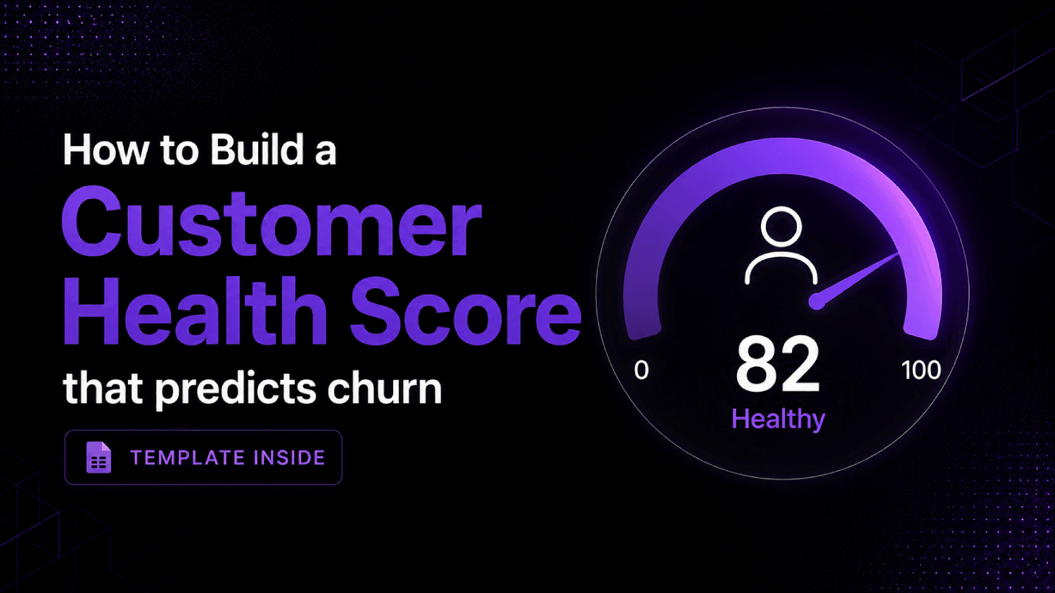
- A customer health score is a weighted composite of product usage, support activity, relationship signals, and financial indicators , not a gut feeling about an account.
- The biggest modeling mistake is treating all signals equally. Login frequency and NPS both matter, but they predict churn at different time horizons and with different reliability.
- A usable health score needs four things: defined signal categories, assigned weights, a scoring scale, and a trigger threshold that routes CSMs to act.
- Customer success platforms like Gainsight, ChurnZero, and Vitally automate the model , but the model still has to be built by a human who understands the product.
- The sample scoring template in this article gives you a starting point you can adapt in a spreadsheet or import into any CS platform.
A customer health score is a single composite number , typically 0 to 100 , that combines product usage, engagement, support signals, and financial data to estimate how likely an account is to renew or churn. Build it by choosing 8 to 12 signals across four categories, assigning weighted point values that sum to 100, then setting red/yellow/green thresholds that trigger specific CSM actions.
Why Most Health Scores Fail Before They Start
The common failure is building a health score from whatever data is easy to pull rather than data that actually correlates with retention. Teams grab login counts, NPS scores, and open support tickets, throw equal weights on each, and call it done. The score looks clean in a dashboard and predicts nothing useful.
The second failure is conflating activity with value realization. A user who logs in daily but never completes a core workflow is not healthy , they are frustrated. A user who logs in twice a month but runs a high-value workflow each time is fine. Raw activity metrics without workflow context are misleading, and this is where most first-version health scores break down.
The third failure is never calibrating the model against actual churn data. If your red-zone accounts are not churning at a meaningfully higher rate than yellow-zone accounts, the signal weights are wrong. Calibration is not optional , it is what separates a health score from decoration.
What Signals Actually Belong in a Health Score Model?
Health score signals fall into four categories. Each category captures a different dimension of the customer relationship, and each predicts churn at a different time horizon. Short-horizon signals (the next 30 days) are usually found in support and engagement data. Long-horizon signals (the next 90 to 180 days) live in product adoption and financial indicators.
Product Adoption Signals
These are the highest-signal inputs in most B2B SaaS models. The relevant metrics are not raw logins but feature adoption breadth (how many of your core feature set a customer has used in the past 30 days), workflow completion rate (whether users are finishing the tasks the product is designed for), and active user percentage (what share of licensed seats are actually in the product). A customer using three of your five core features is more at risk than one who uses all five, regardless of login frequency.
Engagement and Relationship Signals
These capture the human layer of the relationship: executive sponsor responsiveness, CSM meeting attendance, response time to outreach, and participation in business reviews. A customer who ghosts their QBR twice in a row is sending a clear signal weeks before the renewal conversation. Email open rates from the CS team matter here too, though they are a weaker signal than direct meeting behavior.
Support and Sentiment Signals
Open tickets, ticket severity, time-to-resolution trends, and CSAT scores on closed tickets all belong here. NPS fits in this category as well, though with a caveat: NPS is a lagging indicator measured at infrequent intervals, so it should carry lower weight than real-time support signals. A detractor NPS score should flag the account for review, not mechanically drop the health score into red without context.
Financial and Contract Signals
Expansion or contraction of the account, upcoming renewal date proximity, payment history, and whether the customer has a multi-year versus month-to-month contract all belong here. A customer 90 days from renewal with flat usage and no recent CSM engagement is a materially different risk than the same usage profile with 18 months left on contract. The renewal proximity multiplier is one of the most underused adjustments in health score design.
The AboutMartech Signal-Weight Matrix: How to Assign Points That Mean Something
Most guides tell you to assign weights without explaining the logic behind the prioritization. The framework below , the AboutMartech Signal-Weight Matrix , evaluates each candidate signal on three criteria before assigning it a weight. Those criteria are: predictive reliability (does this signal correlate with churn in your cohort data, or is the relationship assumed?), signal freshness (how frequently does the data update, and does it reflect current account status?), and CSM actionability (can a CSM take a specific, meaningful action within a week of the signal changing?). The distinction from generic weighted scoring is in how these three filters interact: a signal that scores high on predictive reliability but low on actionability gets less weight than one that scores moderately on all three, because a signal that cannot drive a CSM workflow produces score movement with no behavioral response. Weight is earned by the combination, not by any single criterion alone.
Apply this filter before you assign a single number. If you do not yet have cohort churn data to validate predictive reliability, start with product adoption weighted heaviest (40 to 50 percent of total), engagement second (25 to 30 percent), support third (15 to 20 percent), and financials last (10 to 15 percent). Rebalance after your first 90-day calibration cycle.
Sample Customer Health Score Template
The table below is a working starting point for a B2B SaaS company with a seat-based or module-based product. Point values are illustrative , they reflect a reasonable starting distribution across the four signal categories and are intended as a calibration baseline, not as benchmarks derived from any specific customer dataset. Adjust them against your own churn cohort data after 60 to 90 days of collection.
| Signal Category | Signal | Max Points | Scoring Logic | Weight % |
|---|---|---|---|---|
| Product Adoption | Feature adoption breadth | 20 | 20 = 80%+ core features used; 10 = 40-79%; 0 = under 40% | 20% |
| Product Adoption | Active user % of licensed seats | 15 | 15 = 70%+ active; 8 = 40-69%; 0 = under 40% | 15% |
| Product Adoption | Core workflow completion rate | 10 | 10 = 75%+ workflows completed; 5 = 40-74%; 0 = under 40% | 10% |
| Engagement | QBR / success review attendance | 15 | 15 = attended last two; 8 = attended one; 0 = missed both | 15% |
| Engagement | CSM outreach response time | 10 | 10 = under 24 hrs; 5 = 1-3 days; 0 = 4+ days or no response | 10% |
| Support | Open critical or high-severity tickets | 10 | 10 = zero open; 5 = one open; 0 = two or more open | 10% |
| Support / Sentiment | Last NPS score | 10 | 10 = Promoter (9-10); 5 = Passive (7-8); 0 = Detractor (0-6) | 10% |
| Financial | Renewal proximity risk | 5 | 5 = 90+ days to renewal; 2 = 31-90 days; 0 = under 30 days (no plan) | 5% |
| Financial | Contract expansion vs. baseline | 5 | 5 = expanded in last 12 months; 3 = flat; 0 = contracted | 5% |
Threshold definitions: 75 to 100 = Green (healthy). 50 to 74 = Yellow (monitor). Below 50 = Red (intervention required). These bands should shift after calibration , if 70 percent of your churned accounts were in yellow rather than red at the 60-day mark, move the red threshold up.
How Do You Build the Score in Practice?
The build sequence matters. Start with data availability, not the ideal signal set. If you cannot reliably pull core workflow completion from your product database, that signal cannot be in your first version. A health score built on three reliable signals outperforms one built on twelve inconsistent ones.
Step 1: Audit your data sources
Map each signal to its source system: product analytics (Mixpanel, Amplitude, your own warehouse), CRM (Salesforce, HubSpot), support desk (Zendesk, Intercom), and survey tools (Delighted, Medallia). Signals that require manual CSM input are lowest priority , they will decay as soon as the team gets busy. For teams with a mature data stack, a customer data platform or reverse ETL layer is often what makes cross-system signal aggregation possible without custom engineering work.
Step 2: Assign weights using the Signal-Weight Matrix
Apply the three criteria described above. For your first version, bias toward signals that update daily or weekly, not monthly. Monthly signals (NPS, QBR attendance) are useful context but should not dominate the composite score because they create false stability between measurement points.
Step 3: Encode and automate
A spreadsheet works for a pilot with under 50 accounts. Beyond that, the manual update burden makes the score stale before it is useful. CS platforms like ChurnZero, Vitally, and Gainsight accept custom health score configurations and update scores automatically as new data arrives. For teams evaluating which platform fits their size and budget, the comparison of ChurnZero vs. Vitally covers the key trade-offs between them in detail.
Step 4: Set triggers, not just thresholds
A threshold that turns an account red without a corresponding playbook is useless. Each band should map to a specific action: red triggers an immediate CSM outreach attempt within 48 hours, yellow triggers a check-in email or product coaching sequence, green triggers an expansion-motion review. The score is an input to a workflow, not a report.
Step 5: Calibrate against churn data at 90 days
Pull every account that churned in the prior quarter and check where their health score sat at 60 days before cancellation. If the score was green for a majority of churned accounts, your weights are wrong. Adjust the predictive signals up and the decorative signals down, then run another calibration cycle. This is not a one-time build.
What Should Trigger a Health Score Alert?
Score-level thresholds catch slow deterioration. Point-level drop triggers catch sudden changes. Both matter. A customer who moves from 72 to 51 over three months is a different risk profile than one who drops from 82 to 48 in two weeks. The sudden drop warrants immediate escalation regardless of the absolute score; it signals an event (executive departure, a bad support experience, a competitive evaluation) that the score average will not surface quickly enough.
Build a drop-rate trigger into your platform: any account that loses 15 or more points in a 14-day window goes to the CSM regardless of current band. This single rule catches a large share of surprise churns that the static threshold misses entirely.
How Does This Integrate With the Broader Customer Stack?
The health score is downstream of your product analytics layer and upstream of your CSM workflow. Teams running product analytics tools like Amplitude or Mixpanel already have the raw behavioral data , the question is whether it flows automatically into the health score or requires manual extraction. Platforms that sit on top of a data warehouse (Vitally, Gainsight) can ingest event streams directly. Lighter platforms often rely on CSV imports or Zapier-style connectors, which introduce lag.
For teams using a warehouse-first data stack, a reverse ETL tool like Hightouch or Census can push computed health scores from the warehouse into the CRM or CS platform without building a custom pipeline, keeping the score in whatever system CSMs actually use. The onboarding stage also feeds the model: accounts that complete key onboarding milestones score higher on feature adoption breadth from day 30 onward, which is why investing in customer onboarding tooling has a measurable downstream effect on health score distributions.
Which CS Platforms Automate Health Score Calculation?
Every major CS platform supports custom health scores, but implementation depth varies. Gainsight offers the most configurability , weighted scorecards, multi-level roll-ups, and AI-assisted risk flags , but it requires significant setup and a dedicated admin to maintain. ChurnZero is faster to implement and well-suited to mid-market SaaS teams that need a working model in weeks rather than months. Vitally targets growth-stage SaaS companies and has a clean interface for configuring composite scores without professional services. Totango and Planhat round out the enterprise-facing options with strong API support for data ingestion.
For teams that are not yet ready for a full CS platform, HubSpot’s Health Score feature (available in its Service Hub at higher tiers) gives a simplified version that works well for companies under 200 customers. For a broader evaluation of the category, the best customer success platforms for B2B SaaS covers thirteen options with pricing and use-case fit.
Frequently Asked Questions
How many signals should a customer health score include?
Eight to twelve signals is the practical range for a first-version model. Fewer than eight and you risk missing important dimensions; more than twelve and the marginal signals start adding noise rather than predictive value. Start with the signals you can automate. A model with eight reliable, automatically updated signals is more accurate in practice than one with fifteen signals where four require manual CSM input and fall behind within weeks of launch.
What is the best formula for a customer health score?
There is no universal formula, but the standard structure is a weighted sum: multiply each signal’s score by its assigned weight percentage, then sum across all signals to produce a score from 0 to 100. The formula is only as good as the weights, and the weights are only as good as your calibration against actual churn data. Start with product adoption weighted at 40 to 45 percent of total, engagement at 25 to 30 percent, support at 15 to 20 percent, and financials at 10 to 15 percent, then adjust after your first 90-day review cycle.
How often should a health score update?
Daily updates are the standard for product and support signals. Engagement signals like QBR attendance update less frequently but should refresh automatically when a meeting is logged or missed. Avoid models that only update weekly , a customer can go from healthy to at-risk in three to five days following a support escalation or a failed workflow attempt. Real-time or near-real-time data pipelines are worth the infrastructure investment for teams managing more than 100 accounts.
Can a customer health score predict churn accurately?
A calibrated model significantly improves churn prediction compared to subjective CSM judgment, but it is not a deterministic predictor. Health scores flag risk; they do not eliminate it. The most common gap is that scores capture behavioral signals well but miss external events: a customer’s budget cut, a champion departure, or a competitive displacement decision that has not yet appeared in product data. Pair the score with regular human touchpoints for accounts in the yellow band.
What is the difference between a health score and an NPS score?
NPS measures stated sentiment at a point in time. A health score measures observed behavior and relationship activity continuously. NPS is an input to the health score model , typically carrying 10 to 15 percent weight , not a substitute for it. A customer can give a Promoter NPS score and still churn if feature adoption is low and contract renewal is imminent, which is exactly the type of false-negative that NPS alone cannot catch.
How do I know if my health score weights are wrong?
Run a churn retrospective at 90-day intervals. Pull every account that churned and check where the health score sat 60 days before cancellation. If more than 30 percent of churned accounts were in green or high yellow at that point, the model is miscalibrated. Increase the weight on signals that were deteriorating in those accounts and reduce the weight on signals that looked stable. Calibration is an ongoing process, not a post-launch task you complete once.
Do I need a CS platform to run a health score?
No, but a spreadsheet-based model breaks down past roughly 50 accounts. A Google Sheet or Airtable base works for a pilot: pull the signal data weekly, apply the weights manually, and color-code by band. Once the model proves useful, the manual update burden will make automation necessary. Most CS platforms charge per seat or per customer record, with pricing ranging from a few hundred dollars per month for smaller tools up to enterprise-only pricing for Gainsight. Evaluate based on account count, data source complexity, and whether your CSMs will actually use the interface.
The Model Is the Work
CS platforms automate health score calculation, but they cannot define what “healthy” means for your product. That definition has to come from someone who understands how customers get value, which workflows signal commitment, and which support patterns precede cancellation. The software is the delivery mechanism. The model is the intellectual work, and it requires iteration.
Start narrower than feels comfortable. Three reliable signals with calibrated weights will tell you more about your at-risk accounts than a twelve-signal model where half the data is stale or manually entered. Expand the model as your data infrastructure improves and as you accumulate calibration cycles. A health score is not a project you finish. It is a measurement system you maintain.
The teams that get the most from health scoring are the ones that connect it directly to CSM workflows with specific playbooks at each threshold. The score changes how a CSM spends their morning, not just how a VP reads a dashboard. That operational connection is what turns a data model into a churn-reduction mechanism.